Synlab: Transforming an Online Healthcare Leader Digital Experience
Healthcare Industry l Redesign l Peru 🇵🇪
Synlab is a leading medical diagnostics company, operating in more than 30 countries across 4 continents. Synlab works closely with healthcare professionals to deliver accurate and timely results for the diagnosis and treatment of various medical conditions. As part of their efforts to reach a wider audience online, they contacted me to collaborate in this exciting project.
The Brief
As Synlab expanded into Peru, they aimed to establish themselves in the local clinical laboratory market with an elevated value proposition: not only do you get all of your analysis done, but you do so in a warm and inviting facility, not cold, clinical and impersonal. However, their current website was not effectively communicating their value proposition, and therefore not working towards their goal. As a result, most of their clients were individuals who either lived nearby or happened to come across their facilities. They recognized the need to reach a broader audience and improve their outreach efforts, and that’s when they called me.
My Role
UX Design
UI Design
Handoff to Development
Client
Synlab
Industry
Healthcare
Type of Project
Web Redesign
Year
2022
The Challenge
My challenge with Synlab was threefold: understand their unique proposal, analyse their current website, and propose a renewed way to navigate their site from both a UX and UI perspective.
Website Analysis
After analysing the client’s website, I found an evident lack of clarity regarding the browsing experience of their different users (patients, institutions, doctors). One of the main issues across the site was an inconsistency in its browsing elements.
#01: Inconsistencies in form and tone
of communication
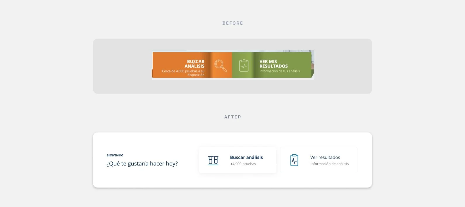
The site’s informational banners had different structures from one another, causing cognitive dissonance on the user, who had to make more efforts to decode the information from each banner. The links and buttons presented similar problems.
#02: Navigation
In an effort to make navigation more efficient, the Synlab site would repeat information in different areas, using the same content but with a different structure. The result was an initial sitemap of the website that contained repetitive information.
#03: Accesibility and responsiveness
It must be pointed out that one of Synlab’s main proposals is the application of vaccines. This made it even more frustrating when you reached the vaccines part of the site to find a chart in JPG format inserted into the site. This, at the very least, was unpleasant to the eye, but it also represented a problem in accessibility when reading, and very little responsiveness across mobile devices.
With all of this information to be considered, we moved onto the next stage in the process.
Wireframing and
UX Design
One of the main challenges in this project was designing a browsing experience that could be used by people of different age groups. Before I could start I had to do some research to identify the users, leading me to two main audiences: first, seniors looking for information about clinical analysis. Second, adults who would look for information about vaccines for their children and clinical analysis for their elderly parents.
Due to this, the proposal for the wireframes was focused on a clear browsing experience, with evident cuts between sections to separate information.
Also, the experience needed to stay solid across devices, to satisfy the needs of both audiences.
Looking for Inspiration
Another important challenge in this project was to transmit the feeling of warmth and hospitality that Synlab provides in their facilities, but in their digital platforms. “Provide a 5 star service in a clinical laboratory”. To understand the client’s point of view, I visited some of their facilities to have a first person experience. These are some pictures of my visit.
With this image clearer in my mind, I was able to translate their vision into an interface that could communicate warmth, professionalism and quality service.
Bringing everything together
With working wireframes, and a design that communicated what I intended, I brough my UX and my UI together:
I proposed a responsive website that would optimize for both clarity and minimalism. Clarity was achieved by organising the content and highlighting what was important to differentiate it from what wasn’t. Minimalism was achieved through a visual point of view where colors, icons, and photography were not aimed at grabbing users' attention, but were gently added as they navigated through it. This is the final result:
Building a User Interface Kit
Near the end of the project, I wanted to ensure that all of these efforts would last in time, so I created a UI Kit for their future needs. This kit contained guides, CTAs and links, photography guidelines, icons, shadows, and font hierarchy across devices. Here's a brief recap of this stage of the project.
Main Shifts
As this project started with consistency issues related to navigation,
I focused most of my efforts on optimizing my design proposal to fix this.
One of my wins in this project was to propose and successfully implement a responsive table to their vaccines page. Prior to this they had a JPG document pasted into the page. Even though it demanded more effort than expected from a design and development point of view, the final result is something I am quite proud of.
Final Metrics
After launch, NeoConsulting evaluated the effectiveness of the site and obtained these results:
329.2%
increase in clicks on the “Contact Us” button
91.5%
increase in searches related
to clinical analysis.
88.5%
increase in clicks on banners.


